Mastering the Art of Waiting: A Guide to Loader Progression UI Elements for Modern Web Design
In the fast-paced digital world we inhabit today, patience is a scarce commodity. When a user clicks a button to upload a file, submit a form, or load a new page, every second of silence feels like an eternity. This is where the Loader Progression UI Elements Kit becomes not just a design asset, but a critical component of user experience (UX). These visual indicators serve as the bridge between user action and system response, transforming a moment of potential frustration into a seamless part of the journey. Whether you are a seasoned developer or a beginner exploring web design widgets, understanding the mechanics and psychology behind these elements is essential for creating intuitive mobile applications and websites.
The Psychology of the Wait: Why Loaders Matter
At its core, a loader or progress bar is a communication tool. In the early days of computing, users often stared at blank screens, unsure if their computer had frozen or if it was simply thinking. This uncertainty creates anxiety. The primary purpose of a loader progression UI element is to eliminate that ambiguity. It tells the user, "We have received your command, and we are working on it."
From a psychological perspective, these elements manage expectations. A static screen implies a broken system, whereas a moving animation implies activity. When designed correctly, a progress bar can actually make the wait feel shorter than it objectively is. This phenomenon is known as perceived performance. By providing visual feedback, you keep the user engaged and reassure them that the process is moving forward. This is particularly crucial during an uploading process, where files can vary greatly in size and transfer speed. Without a clear indicator, a user might refresh the page or abandon the task entirely, leading to lost data and poor conversion rates.
Deconstructing the Loader Progression UI Elements Kit
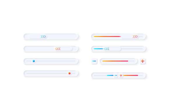
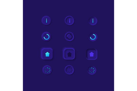
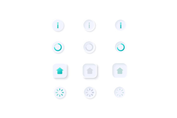
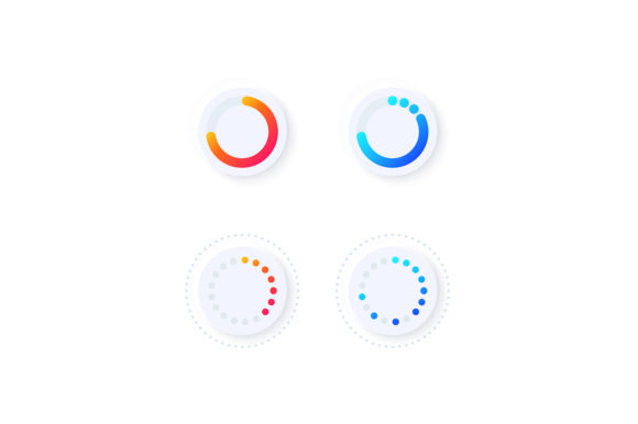
A comprehensive Loader Progression UI Elements Kit is more than just a single spinning circle. It is a curated collection of assets designed to fit various contexts within a digital interface. These kits typically include a wide range of styles, from minimalist lines to complex dashboard templates, ensuring that there is a solution for every brand identity.
When you download such a kit, usually provided as a ZIP file, you gain access to a versatile library of formats including EPS, JPG, PNG, SVG, and AI. Let's break down why this variety matters:
- SVG (Scalable Vector Graphics): Ideal for web and mobile development. SVGs remain crisp at any resolution, making them perfect for high-DPI retina displays on modern smartphones.
- AI and EPS: These are editable vector formats used in Adobe Illustrator. They allow designers to tweak colors, shapes, and animation paths to match specific brand guidelines before exporting.
- PNG and JPG: Raster images useful for quick prototyping, presentations, or situations where vector support is limited.
This diversity ensures that whether you are building a native iOS app, an Android application, or a responsive website, you have the right file type ready for implementation. The inclusion of a light theme interface in many of these collections is particularly notable, as clean, bright aesthetics are currently dominating modern web design trends, promoting clarity and focus.
Practical Applications in Mobile and Web Design
The utility of these widgets extends far beyond simple page loads. In modern application architecture, loaders are integrated into complex workflows. Consider a social media app where a user is uploading a high-resolution video. A simple spinner isn't enough; the user needs to know how much has been uploaded and how much remains. Here, a bar and dashboard template becomes invaluable. It provides granular data, perhaps showing percentage completion, file size processed, and estimated time remaining.
Furthermore, these elements are vital for isolated vector icons used in micro-interactions. For instance, when a user pulls down to refresh a feed, a custom loader animation can add a touch of personality to the app. It reinforces brand identity even during mundane tasks. Imagine a fitness app where the loading bar fills up like a water tank, or a finance app where the loader mimics a growing chart. These creative touches transform a functional necessity into a delightful user experience.
Choosing the Right Format for Your Project
Selecting the appropriate asset from your UI kit depends on your technical constraints and design goals. If you are working on a project that requires heavy customization and animation via CSS or JavaScript, starting with the SVG or AI files is the best approach. These formats allow you to separate layers and animate specific parts of the loader independently.
Conversely, if you are rapidly prototyping a concept in a tool like Figma or Sketch and need a static representation to show a client, the PNG files with transparent backgrounds offer immediate usability. The JPG format, while less common for interface elements due to lack of transparency support, can be useful for documentation or mockups placed on solid backgrounds.
It is a common misunderstanding that all loaders must be identical across an application. In reality, context dictates the design. A full-screen loader might be appropriate for a major system update, while a small, subtle icon suffices for loading a comment section. A good UI kit provides this variety, allowing you to scale the intensity of the feedback based on the importance of the task.
The Role of Light Theme Interfaces in Modern UX
The shift towards light theme interfaces in web and mobile design is driven by a desire for cleanliness and readability. Light themes often convey a sense of openness and efficiency. When integrating loader elements into a light theme, contrast becomes key. The loader must be visible without being jarring. Most high-quality UI kits designed for light themes utilize soft grays, vibrant accent colors, or subtle shadows to ensure the animation pops against a white or off-white background.
This aesthetic choice also impacts how users perceive the speed of the application. Light interfaces often feel "snappier" and more responsive. When paired with smooth, well-engineered progression bars, the entire application feels more polished. This is why designers often seek out collections specifically tagged for light themes, ensuring that the visual language remains consistent from the dashboard to the smallest loading icon.
Best Practices for Implementation
To get the most out of your Loader Progression UI Elements Kit, consider the following best practices:
- Maintain Consistency: Use variations of the same loader style throughout your app to create a cohesive experience. Don't mix a skeletal loader on one page with a spinning circle on another unless there is a distinct functional reason.
- Optimize Performance: Even though vector files are lightweight, ensure your code implementation doesn't cause layout shifts. The space for the loader should be reserved in the layout before the content loads.
- Provide Context: Whenever possible, accompany the visual loader with text. Phrases like "Uploading your photos..." or "Processing payment..." reduce anxiety significantly more than a graphic alone.
- Test on Multiple Devices: Ensure your chosen SVG or PNG assets look sharp on both large desktop monitors and small mobile screens.
Conclusion: Elevating User Experience Through Detail
In the grand scheme of software development, a loader might seem like a minor detail. However, it is often the difference between a user feeling confident in your platform and feeling frustrated. The Loader Progression UI Elements Kit provides the tools necessary to master this delicate balance. By offering a range of formats like EPS, JPG, PNG, SVG, and AI, these kits empower designers and developers to create tailored solutions for every scenario.
Whether you are designing a complex dashboard template for enterprise software or a simple mobile application for consumers, the way you handle waiting times defines the quality of your product. Embracing these UI elements allows you to turn dead time into engaging time, fostering trust and satisfaction. As technology continues to evolve, the expectation for seamless, instantaneous feedback will only grow. By leveraging high-quality, versatile loader assets, you ensure that your digital products are not only functional but also empathetic to the human experience of waiting.