Maximizing Your Design Workflow with the Trainer Web UI Kit
Starting a new web design project often feels like standing at the base of a mountain. You have a clear vision of the summit—a sleek, functional, and professional interface—but the climb can be arduous without the right gear. This is where a comprehensive resource like the Trainer Web UI Kit becomes invaluable. Designed for everyone from seasoned professionals to ambitious beginners, this template offers a Modern and Minimal aesthetic that serves as a robust foundation for fitness platforms, coaching sites, educational portals, and corporate dashboards. However, possessing high-quality tools is only half the battle; knowing how to wield them effectively separates a polished final product from a mediocre one.
The Trainer Web UI Kit stands out because it is not just a collection of pretty pictures. It is a structured system available in four major formats: PSD, Sketch, Figma, and Adobe XD. This versatility ensures that regardless of your preferred design environment, you can hit the ground running. The files come with well-organized layers, purposeful elements, and creative widgets that are fully customizable and pixel-perfect. Yet, many users stumble not because the tool lacks capability, but because they overlook critical aspects of implementation and customization. Understanding these potential pitfalls can save you hours of frustration and ensure your final output matches the quality of the source files.
The Trap of Ignoring File Format Compatibility
One of the most common oversights occurs before the design process even begins. Users often download a UI kit assuming all formats are identical in functionality. While the Trainer Web UI Kit provides files for PSD, Sketch, Figma, and Adobe XD, each software handles components, auto-layouts, and symbols differently. A beginner might open the Figma file expecting the exact same layer structure as the PSD version, leading to confusion when trying to edit specific elements.
To avoid this, always assess your team's workflow before selecting a file format. If you are collaborating with developers, Figma or Adobe XD often offers smoother handoff features compared to static PSD files. If you are working solo on a legacy system, Photoshop might be your stronghold. The mistake lies in choosing a format based on habit rather than project needs. By aligning your file choice with your end-goal, you leverage the "well-organized layers" feature more effectively, ensuring that every widget and element remains easily editable throughout the design lifecycle.
Misunderstanding the Scope of Included Assets
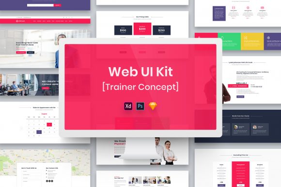
A frequent source of disappointment for new buyers is the expectation that every visual element seen in the preview images is ready to use immediately. It is crucial to read the documentation carefully: All Images, Vectors, and Mock-ups are just used for preview purposes only and NOT included in the download files. This is a standard industry practice to respect intellectual property rights, as the credits for those specific assets go to their respective authors.
When users fail to recognize this distinction, they may waste valuable time searching for non-existent folders within the download package. This delay can disrupt project timelines and create unnecessary stress. The corrective approach is to treat the preview images as inspiration rather than inventory. Use the provided placeholders to plan your layout, then source your own high-quality photography or illustrations that align with your brand identity. This actually enhances your project, as custom imagery prevents your site from looking like a generic template. The Trainer Web UI Kit provides the structural framework; you provide the soul through your unique content.
Neglecting Typography and Font Licensing
Typography can make or break a minimal design. The Trainer Web UI Kit utilizes free fonts to maintain accessibility and cost-effectiveness, but a subtle error often occurs here. Designers sometimes assume the fonts are pre-installed on their systems or embedded directly into the design file in a way that allows immediate editing without setup. In reality, you must locate the "Fonts Used" file included in your download package to find the specific links for installation.
Skipping this step results in fallback fonts rendering on your screen, which distorts the spacing, alignment, and overall aesthetic of the Minimal Design. What was intended to look crisp and professional may appear broken or amateurish. To prevent this, make font installation your very first step after downloading. Furthermore, even though the fonts are free, always double-check the licensing terms linked in the documentation. Some free fonts are for personal use only, while others allow commercial application. Ensuring compliance protects you from legal issues down the road and guarantees that your Retina Ready designs look exactly as the creator intended.
Over-Customization and Loss of Cohesion
Because the files are fully customizable, there is a temptation to change everything. Beginners and eager entrepreneurs often feel the need to alter colors, reshape buttons, and rearrange widgets immediately upon opening the file. While customization is a strength of this UI kit, over-doing it can dismantle the careful balance achieved by the original designer. The "Purposeful Elements" included in the kit were arranged to guide the user's eye and establish a logical hierarchy.
Disrupting this hierarchy without a solid understanding of UX principles can lead to a cluttered interface that confuses visitors. For instance, changing the contrast ratios of the minimal color palette might reduce readability, negatively affecting accessibility. Instead of reinventing the wheel, start by making small, incremental changes. Test how a single color shift affects the mood of the page. Use the provided widgets as a baseline for best practices. If a button style works well in the demo, there is likely a usability reason for it. Preserve the core structure while injecting your brand personality through imagery and copy, rather than dismantling the layout itself.
Failing to Optimize for Retina Displays
In an era where high-resolution screens are the norm, delivering blurry assets is a cardinal sin. The Trainer Web UI Kit is marketed as Retina Ready, meaning the vector shapes and layout grids are designed to scale perfectly on high-DPI displays. However, this benefit is lost if the exporter exports assets incorrectly. A common mistake is exporting icons or graphics as low-resolution JPEGs instead of SVGs or 2x/3x PNGs.
This oversight directly impacts the perceived quality of your website. A fuzzy logo on a crisp, modern interface signals negligence to your audience. To maintain the "Pixel Perfect" promise of the kit, ensure your export settings match the target device density. When using Figma or Sketch, utilize the built-in export presets for retina screens. This attention to detail ensures that the clean lines and sharp typography of the minimal design remain intact across smartphones, tablets, and desktop monitors.
Making the Right Choice for Your Project
Ultimately, the value of the Trainer Web UI Kit lies in how well it integrates into your specific workflow. Before committing to a design direction, ask yourself if the minimal style suits your content volume. Minimalism thrives on whitespace and concise messaging; if your platform requires dense data tables or complex navigation, you may need to adapt the kit significantly. There is no shame in choosing a different template if the fit isn't right, but if you proceed with this kit, respect its design language.
By avoiding these common pitfalls—ignoring format nuances, misunderstanding asset inclusion, neglecting fonts, over-customizing, and poor exporting—you transform a simple template download into a professional-grade deliverable. Whether you are a freelancer building a portfolio, a marketer launching a campaign, or an educator creating a learning hub, the key is to use the tool as a partner, not a crutch. With the right approach, the well-organized layers and creative elements of this UI kit will empower you to build something truly exceptional.