Maximizing Your Design Workflow with the App Presentation Web UI Kit
Launching a new application or showcasing a web project often hinges on the quality of your presentation. In a digital landscape saturated with content, first impressions are not just important; they are definitive. This is where a robust App Presentation Web UI Kit becomes an indispensable asset for creators, marketers, and entrepreneurs alike. However, simply downloading a template does not guarantee success. Many users fall into the trap of assuming that a high-quality design file automatically translates to a polished final product without additional effort or strategic thinking. Understanding the nuances of these tools—specifically modern, minimal designs available in PSD, Figma, Sketch, and Adobe XD formats—is crucial for leveraging them effectively.
The primary appeal of a well-constructed UI kit lies in its ability to accelerate the design process while maintaining professional standards. When you access a package containing well-organized layers and purposeful elements, you are essentially buying back time. Yet, a common misconception among beginners and even some seasoned freelancers is that "minimal design" equates to "easy to customize." Minimalism requires precision. Because there are fewer decorative elements to hide behind, every alignment, spacing choice, and font selection must be deliberate. If you treat a minimal template as a canvas for clutter, you undermine the very architecture that makes it effective.
Avoiding the Trap of Disorganized Customization
One of the most frequent mistakes users make when working with multi-format kits is ignoring the structural integrity of the files. Whether you are using the Figma version for collaborative prototyping or the PSD file for detailed raster editing, the value of the kit relies heavily on its organization. Users often rush to change colors and swap images without first understanding the layer hierarchy. This haphazard approach can lead to broken layouts, misaligned widgets, and a final output that looks amateurish despite starting with a pixel-perfect foundation.
To avoid this, take a moment to explore the file structure before making changes. A professional kit will feature grouped elements and clearly named layers. Respect this organization. If you need to add a new section, mimic the existing grouping logic rather than dumping new elements onto the canvas. This ensures that when you or a client needs to make future edits, the file remains manageable. Remember, efficiency is not just about how fast you start, but how easily you can iterate later.
The Critical Importance of Typography and Licensing
Typography can make or break a web presentation. A significant oversight occurs when designers assume the fonts used in the preview images are free for commercial use or included in the download. It is vital to read the documentation provided with your App Presentation Web UI Kit. Most reputable templates, including those offering retina-ready designs, will include a "Fonts Used" file with links to the original typefaces.
Neglecting to verify font licenses can lead to legal complications down the road, especially for small business owners and agencies presenting work to clients. Furthermore, substituting a carefully chosen display font with a default system font can drastically alter the visual tone of the project. The advice here is simple: follow the links provided in the package. If a font requires a purchase, view it as an investment in the professionalism of your brand. If you must substitute, choose a typeface with similar x-heights and weighting to maintain the intended balance of the layout.
Managing Expectations Regarding Assets
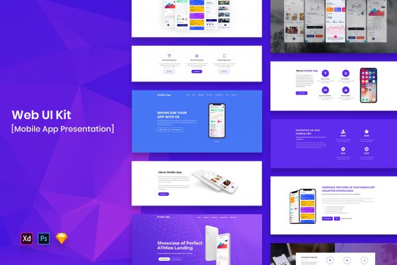
Another area where confusion often arises involves the images, vectors, and mock-ups seen in the promotional previews. It is a standard industry practice that these specific assets are used for demonstration purposes only and are not included in the actual download files. Users sometimes feel misled when they open the file and find placeholder graphics instead of the stunning photography shown on the sales page.
This misunderstanding can stall a project if you are unprepared. The corrective approach is to view the template as a skeleton waiting for your unique content. Before you begin customization, gather your own high-resolution images, brand logos, and vector icons. Using low-quality placeholders or stretching small images to fit large hero sections will degrade the retina-ready quality of the design. Ensure your assets are optimized for web performance and visual clarity to truly honor the potential of the template.
Choosing the Right Format for Your Workflow
With four formats included—PSD, Figma, Sketch, and Adobe XD—you have the flexibility to work in your preferred environment. However, a mistake many make is choosing a format based solely on familiarity rather than suitability for the task. For instance, if your goal is real-time collaboration with a development team, Figma or Adobe XD might offer superior handoff features compared to a static PSD file. Conversely, if you need deep pixel-level manipulation for a complex marketing banner, Photoshop remains unmatched.
Do not force a tool to do a job it isn't best suited for. Evaluate the end goal of your presentation. Are you building an interactive prototype? Is this for a static pitch deck? Selecting the right file format from the start prevents the frustration of trying to export assets or share links that don't function as intended. The beauty of a comprehensive kit is that you aren't locked into one ecosystem; leverage that freedom to match the tool to the task.
Ensuring Consistency Across Devices
In an era where mobile traffic often surpasses desktop, overlooking responsive considerations is a costly error. While a Web UI Kit Template provides the visual design, it is up to you to ensure the concepts translate well across different screen sizes. A common pitfall is designing strictly for the desktop view provided in the template and assuming it will scale down perfectly.
Minimal designs are particularly sensitive to scaling issues. Elements that look spacious on a 27-inch monitor can appear cramped on a smartphone screen. To mitigate this, use the fully customizable nature of the layers to create variations for mobile and tablet views if your presentation software allows it. Even if you are only presenting static screens, showing awareness of responsive behavior adds a layer of credibility to your proposal. It demonstrates to stakeholders that you have thought beyond the immediate aesthetic to the user experience.
Ultimately, the value of an App Presentation Web UI Kit is realized not just in the download, but in the thoughtful application of its components. By respecting the file structure, verifying font licenses, preparing your own high-quality assets, and choosing the appropriate software format, you transform a generic template into a bespoke presentation tool. Avoid the urge to rush the setup phase. The time invested in understanding the kit's architecture pays dividends in the smoothness of your workflow and the polish of your final delivery. Whether you are a hobbyist launching a side project or a marketer pitching a major campaign, these disciplined practices ensure your work stands out for the right reasons.