Mastering User Choice: The Essential Guide to Option Buttons and UI Design Kits
In the vast digital landscape where websites and mobile applications serve as the primary interface between businesses and users, the smallest details often dictate the success of an interaction. Among these critical details are option buttons, commonly known as radio buttons. While they may appear insignificant at first glance, these UI elements are the backbone of user decision-making processes. From selecting a shipping method during an online checkout to configuring complex dashboard settings, option buttons guide users through choices with clarity and precision. This article explores the significance of comprehensive Option Buttons UI Elements Kits, their role in modern web design, and how leveraging high-quality assets like vector icons and dashboard templates can elevate the user experience.
Understanding the Core Function of Option Buttons
At its most fundamental level, an option button is a graphical control element that allows the user to select exactly one option from a predefined set. Unlike checkboxes, which permit multiple selections, option buttons enforce mutual exclusivity. This distinction is vital for maintaining data integrity and preventing user error. Imagine a scenario in an online payment gateway where a user must choose between "Credit Card," "PayPal," or "Bank Transfer." Allowing a user to select all three simultaneously would create a logical conflict in the transaction processing system. Here, the option button serves as a guardian of logic, ensuring the system receives a single, clear instruction.
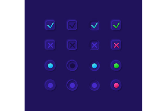
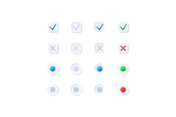
The visual language of these elements is standardized yet flexible. Typically represented as a small circle that fills with a dot or color when selected, they are instantly recognizable to users across different cultures and platforms. However, the default browser rendering of these elements is often bland and inconsistent across devices. This is where a dedicated UI Elements Kit becomes indispensable. By utilizing a curated collection of custom-designed buttons, designers can maintain brand consistency while adhering to usability standards.
The Evolution from Static to Dynamic Interfaces
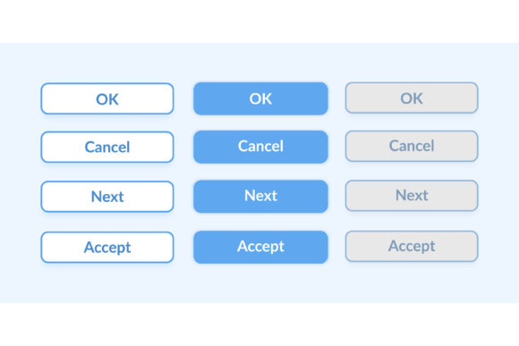
Gone are the days when web interfaces were static and rigid. Modern web design widgets are dynamic, responsive, and deeply integrated into the overall aesthetic of an application. A high-quality UI kit does not merely provide a shape; it provides a state. It includes designs for the default state, the hover state, the active selection, and even the disabled state. This level of detail is crucial for creating a light theme interface that feels alive and responsive to user input.
Consider a dashboard template used for financial tracking. The settings panel might require users to toggle between viewing data in "Daily," "Weekly," or "Monthly" increments. If these option buttons are poorly designed or lack visual feedback, the user may become uncertain about their current selection. A professional UI kit ensures that the selected state is distinct, perhaps using a subtle shadow, a vibrant accent color, or a smooth animation transition. This attention to detail reduces cognitive load, allowing the user to focus on the data rather than the interface mechanics.
The Strategic Value of Comprehensive UI Kits
For designers and developers, time is a scarce resource. Building every UI component from scratch is not only inefficient but also prone to inconsistencies. An Option Buttons UI Elements Kit acts as a accelerant for the design process. These kits typically come in a variety of file formats to suit different stages of the workflow, including JPG for previews, PNG for web-ready assets with transparency, and vector formats like EPS, SVG, and AI for infinite scalability.
The inclusion of vector files is particularly significant. In an era where users access content on everything from 4K desktop monitors to compact mobile screens, scalability is non-negotiable. A raster image (like a JPG) will pixelate when enlarged, ruining the professional look of an application. Conversely, an SVG or AI file remains crisp at any size. This ensures that whether the option button is part of a massive enterprise dashboard or a tiny setting toggle in a mobile app, the visual quality remains pristine.
Bridging the Gap Between Design and Development
A common misunderstanding in the industry is that UI kits are solely for graphic designers. In reality, they are a collaborative tool that bridges the gap between design and development. When a designer hands off a project containing organized vector icons and structured layers in an AI or EPS file, developers can easily extract the necessary assets or replicate the styles in CSS. This shared language reduces friction, minimizes miscommunication, and ensures that the final product matches the original vision.
Furthermore, these kits often include isolated icons specifically designed for contexts like online payments. Security and trust are paramount in financial transactions. Using generic or low-quality icons for payment methods can inadvertently signal a lack of professionalism or even raise security concerns for wary users. A specialized kit provides polished, recognizable icons for Visa, MasterCard, Bitcoin, and other payment gateways, reinforcing trust and streamlining the checkout experience.
Practical Applications in Modern Technology
The utility of option buttons extends far beyond simple forms. They are integral to the functionality of modern mobile applications. On a small screen, where touch targets must be large enough to be tapped accurately, the design of the option button becomes a matter of accessibility. A well-crafted UI kit ensures that these elements meet accessibility guidelines, providing sufficient contrast and touch area. This is especially important in a light theme interface, where low-contrast grays can easily become illegible under bright sunlight.
In the realm of education and e-learning platforms, option buttons are the standard mechanism for multiple-choice quizzes. Here, the immediate visual feedback provided by a good UI design helps learners understand their progress instantly. If a student selects an answer, the interface should clearly indicate the selection before submission. Ambiguity here can lead to frustration and disengagement. By employing a robust widget collection, educational platforms can create engaging, intuitive testing environments that feel more like interactive games than rigid examinations.
Enhancing Business Logic Through Better UX
From a business perspective, the clarity provided by option buttons directly impacts conversion rates. In the context of a bar and dashboard template, executives rely on filters to slice and dice data. If the filter options (e.g., "Show Active Users" vs. "Show All Users") are confusing, the data analysis suffers. Clear, distinct option buttons empower users to manipulate complex data sets with confidence. This efficiency translates to better decision-making and, ultimately, better business outcomes.
Moreover, customization is key. Not every brand fits the standard blue-and-white aesthetic. A versatile UI kit allows businesses to inject their brand personality into functional elements. Whether it's a playful rounded square for a gaming app or a sharp, minimalist circle for a fintech startup, the ability to customize these elements without breaking their functionality is a powerful advantage.
Selecting the Right Assets for Your Project
When choosing a UI kit, it is essential to consider the file types provided. For web projects, SVG is often the gold standard due to its small file size and scalability. For print materials or high-fidelity mockups presented to stakeholders, EPS and AI files offer the flexibility needed for extensive editing. Meanwhile, PNG files remain useful for quick prototyping or when vector support is limited in certain legacy systems. Understanding the strengths of each format ensures that you select the right tool for the job.
It is also worth noting that a good kit is not just about the individual components but how they work together. The spacing, the typography, and the color palette of the option buttons should harmonize with the accompanying bars, charts, and icons in the dashboard template. This holistic approach to design creates a cohesive user experience that feels intentional and polished.
Conclusion: The Power of Small Choices
In conclusion, option buttons are far more than mere decorative circles on a screen. They are fundamental instruments of communication between the user and the machine. They simplify complex choices, enforce logical constraints, and guide users toward their goals with ease. By investing in a high-quality Option Buttons UI Elements Kit, designers and developers can save time, ensure consistency, and deliver a superior user experience.
Whether you are building a next-generation mobile application, designing a secure online payment portal, or crafting an analytical dashboard, the quality of your UI elements matters. Embrace the versatility of vector formats like SVG and AI, prioritize accessibility in your light theme interfaces, and remember that in the world of user interface design, the smallest elements often make the biggest impact. By mastering these tools, you empower your users to navigate the digital world with confidence and clarity.