Building Modern Dashboards with the Panel UI Elements Kit
In the fast-paced world of digital product design, speed and consistency are not just luxuries; they are necessities. Whether you are crafting a complex analytics dashboard for a fintech startup or a sleek mobile application for a lifestyle brand, the foundation of your project lies in its user interface components. This is where a comprehensive resource like the Panel UI Elements Kit becomes an indispensable asset for designers and developers alike. It represents more than just a collection of graphics; it is a structured system designed to accelerate workflow while maintaining high aesthetic standards.
The modern web and mobile landscape has shifted dramatically toward data-heavy interfaces that must remain intuitive. Users expect seamless interactions, instant feedback, and visual clarity, regardless of whether they are on a desktop monitor or a smartphone screen. Meeting these expectations from scratch can be time-consuming. By leveraging a pre-built dashboard template and widget collection, teams can bypass the repetitive task of drawing basic elements and focus instead on logic, user flow, and unique branding touches.
The Power of a Dark Theme Interface
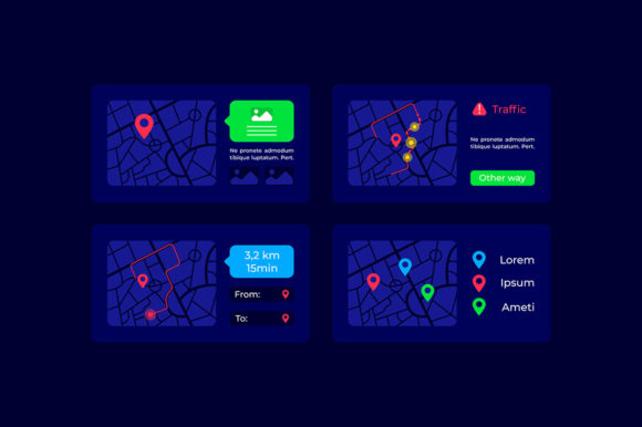
One of the most striking features included in this kit is the dedicated dark theme interface. For years, light modes were the default standard, but the tide has turned. Dark themes are now preferred for professional tools, gaming applications, and media-rich platforms because they reduce eye strain during prolonged usage and make colorful data visualizations pop with greater contrast. Designing a dark mode from scratch requires a nuanced understanding of elevation, shadow, and color saturation to ensure text remains readable without appearing washed out.
The Panel UI elements kit addresses this by providing a cohesive dark palette where every component, from buttons to background cards, has been calibrated for optimal visibility. When you implement these elements, you aren't just changing colors; you are adopting a hierarchy that guides the user's eye naturally through the interface. This is particularly crucial for dashboard templates where users need to scan large amounts of information quickly. The dark background serves as a canvas that allows critical metrics and alerts to stand out immediately, improving the overall user experience.
Essential Navigation and Search Functionality
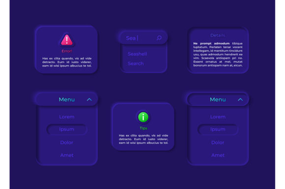
No application is complete without robust navigation, and the search bar is often the primary entry point for users looking for specific data. In a well-designed system, the search bar is not merely an input field; it is a interactive element that suggests, filters, and guides. The assets provided in this collection include varied states for search inputs—idle, active, focused, and error states—ensuring that the interaction feels responsive and polished.
Beyond simple text entry, the kit includes sophisticated navigation aids like the dropdown menu isolated vector icon. These icons are critical for maintaining a clean layout. Instead of cluttering the screen with endless options, a dropdown allows users to access deeper layers of functionality only when needed. The "isolated" nature of these vector icons means they are ready to be dropped into any context without background artifacts, making them perfect for both web and mobile environments. Whether you are building a settings menu or a filter system for a data table, these components provide the structural integrity needed for complex navigation.
Optimizing for Mobile and Web Workflows
The versatility of the Panel UI Elements Kit shines when considering the dual demands of web and mobile design. A common pitfall in modern development is treating mobile as an afterthought. However, this widget collection is explicitly engineered for mobile application contexts while scaling perfectly to desktop browsers. The components are designed with touch targets in mind, ensuring that buttons and interactive bars are large enough to be tapped comfortably on smaller screens.
For designers working in Adobe Illustrator or other vector-based software, the inclusion of AI and EPS files is a game-changer. These formats allow for infinite scalability. You can resize a chart axis or a navigation bar to fit a 4K monitor or a smartwatch display without losing a single pixel of quality. This flexibility supports a truly responsive design workflow, where one master file can generate assets for multiple breakpoints. Furthermore, the presence of SVG files ensures that developers can implement these graphics directly into code, keeping file sizes small and loading times fast—a critical factor for SEO and user retention.
File Formats and Integration Ease
Understanding the technical delivery of design assets is vital for team collaboration. The ZIP file containing the kit is organized to support various stages of the design-to-development handoff. Inside, you will find:
- AI (Adobe Illustrator): The source files for deep editing and customization.
- EPS: A universal vector format compatible with many design suites.
- SVG: Ideal for web implementation and interactive animations.
- PNG: Rasterized versions with transparency for quick prototyping or use in non-vector environments.
- JPG: High-quality previews for presentations and documentation.
This variety ensures that no matter what tool your team uses, the Panel UI elements kit integrates smoothly. For instance, a UX researcher might use the JPGs to create a clickable prototype for user testing, while a UI designer refines the vectors in AI, and a frontend developer copies the SVG code directly into the repository. This seamless transition reduces friction and minimizes the risk of design drift, where the final product looks different from the original mockup.
Practical Applications in Industry Projects
Consider a scenario where a SaaS company is launching a new analytics platform. They need to display real-time data, manage user permissions, and offer customizable views. Starting with a bar and dashboard template from this kit allows them to establish the visual language within hours rather than weeks. The pre-styled charts, progress bars, and data cards provide a professional look immediately. The team can then spend their energy connecting these elements to live APIs and refining the algorithms behind the data, rather than debating the border radius of a card or the shade of a secondary button.
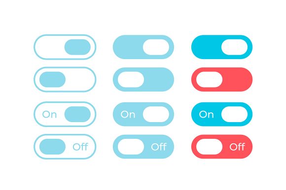
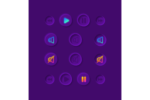
Similarly, for mobile app developers, the widget collection offers a library of ready-to-use controls. From toggle switches to sliding drawers, these elements adhere to modern design principles. Using standardized components also helps in maintaining accessibility standards, as these kits are often built with contrast ratios and spacing guidelines that comply with WCAG (Web Content Accessibility Guidelines). This attention to detail ensures that the final application is usable by a wider audience, including those with visual impairments.
Making the Right Choice for Your Project
When evaluating whether to adopt a specific UI kit, several factors come into play. First is the cohesiveness of the design. Do the icons match the typography? Do the shadows and gradients feel consistent across different widgets? The Panel UI Elements Kit excels here by offering a unified visual system. Second is the flexibility of the assets. Can you easily change the primary color to match your brand identity? With vector-based sources, recoloring entire sections of a dashboard is a trivial task.
Another consideration is the scope of the project. If you are building a simple landing page, a full dashboard kit might seem like overkill. However, if there is any chance your project will grow into a web application with user accounts and data visualization, having these resources on hand future-proofs your design. It allows for scalable growth without the need to redesign the core interface later. The inclusion of specific elements like the dropdown menu isolated vector icon and specialized search bar variations indicates a depth of thought that covers edge cases often overlooked in simpler kits.
Ultimately, the goal of using such a resource is to elevate the quality of the final product while respecting the constraints of time and budget. In an industry where "time to market" can determine the success of a product, tools that streamline the creative process are invaluable. The Panel UI elements kit provides a solid foundation, allowing creators to build upon a framework of excellence. Whether you are a freelance designer looking to deliver faster or an in-house team aiming for consistency across multiple products, integrating this collection into your workflow offers immediate, tangible benefits.
By focusing on practical utility, modern aesthetics like the dark theme interface, and technical flexibility through diverse file formats, this kit stands out as a comprehensive solution. It bridges the gap between conceptual design and functional reality, ensuring that the dashboards and applications we build are not only beautiful but also highly functional and user-centric. As digital interfaces continue to evolve, having a reliable set of high-quality elements will remain a cornerstone of efficient and effective web design.